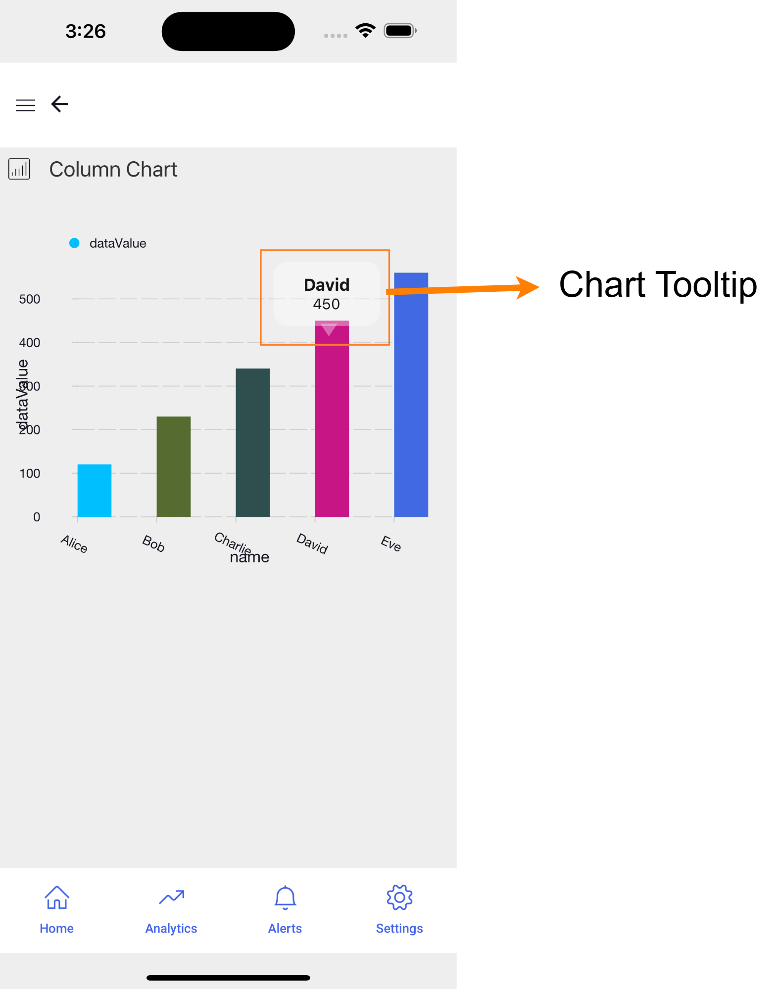
Chart Tooltips
A Chart Tooltip is an element that appears when you hover over or interact with a specific data point or component within a chart. This floating text box provides additional information about the data point, such as its exact value, category, or other relevant details, enhancing user understanding of the chart.
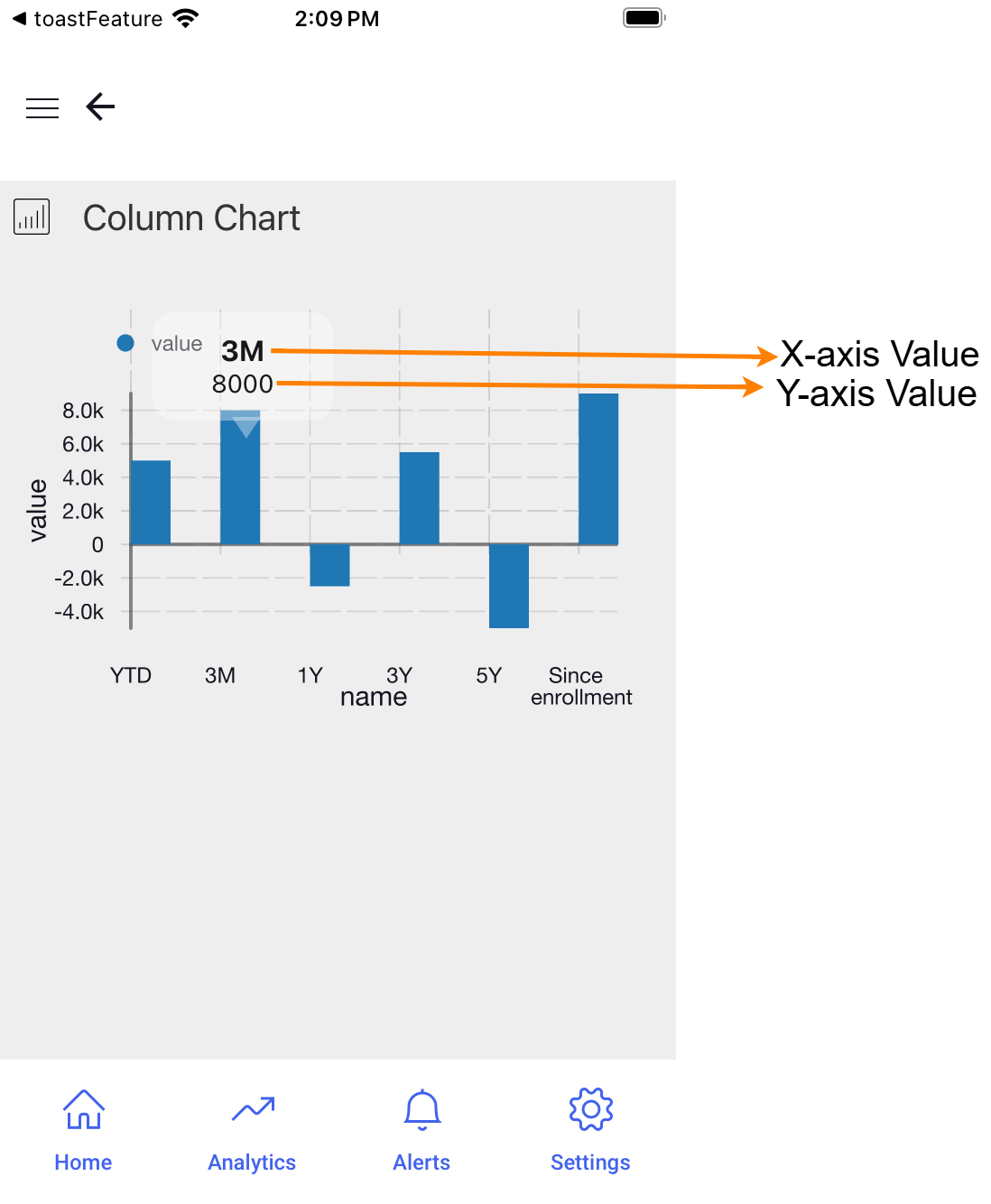
WaveMaker Inbuilt Tooltip
By default, we have Chart tooltip that displays the x-axis and y-axis values as shown below.
Customizing Chart Tooltip
You can add the basic style changes like font, background color, and text size of the default Tooltip by the given CSS classes.
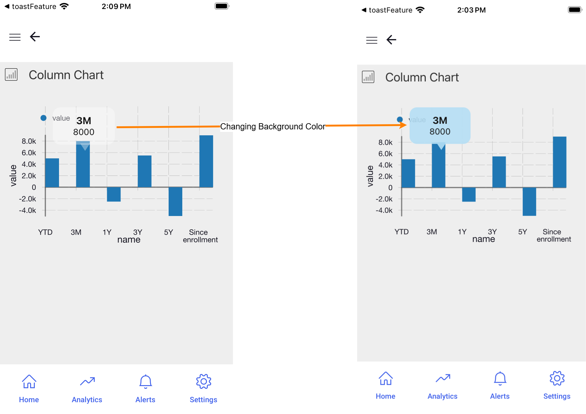
CSS classes for styling are Chart specific.
In cases where you need to create a completely different Tooltip where changes are done to the Tooltip content, you can easily create a custom Tooltip by following steps in Custom Tooltip.
Styling Inbuilt Tooltip
The Tooltip provided by default can be categorized into four segments for customization.
- Tooltip Container: The main box that holds the tooltip content.
- Tooltip Pointer: The small arrow or indicator pointing to the data point.
- X-Axis Label: The label displaying information related to the x-axis value.
- Y-Axis Label: The label displaying information related to the y-axis value.
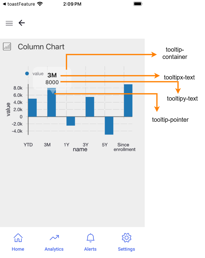
The following CSS classes can be utilized in the Style section to customize various parts of the default tooltip, as shown in the image above:
- Tooltip Container:
.app-column-chart-tooltip-container {
  /* Your styles here */
}
- Tooltip Pointer:
.app-column-chart-tooltip-pointer {
  /* Your styles here */
}
- X-Axis Label:
.app-column-chart-tooltipx-text {
  /* Your styles here */
}
- Y-Axis Label:
.app-column-chart-tooltipy-text {
  /* Your styles here */
}
Styling Tooltip Pointer
The properties to style the Tooltip pointer using the CSS class, .app-column-chart-tooltip-pointer are given below.
/* To change the pointer color use border-bottom-color property */

border-bottom-color: "blue";

/* To change the height of the pointer use border-left-width and border-right-width properties  */

border-left-width: 10px;
border-right-width: 10px;

/* To change the width of pointer use border-bottom-width property */

border-bottom-width: 15px;
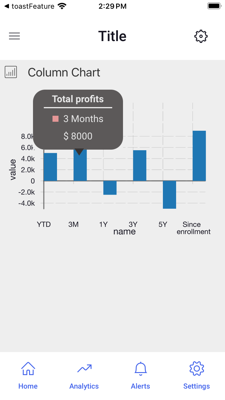
Creating Custom Tooltip
A Partial can be created as a Tooltip for a chart in your application. This approach allows you to reuse the Partial with the tooltip across the application in any number of instances.
Creating Partial Page
- Create a new page and designate it as a Partial page. This page will serve as the tooltip for your Chart.
- Add an page parameter called
itemto the partial page. This parameter will contain the selectediteminformation, including theindex,name, andvalue, which can be used in the Partial to create the Tooltip. - Drag and Drop the necessary widgets like, labels or container to the partial page to display the information from the selected item.
- Bind the item parameter to these widgets to ensure the tooltip displays the correct data.
Binding Partial to Chart
- Navigate to the Script section of the page where the Chart widget is used.
- To bind, use the following syntax to bind the Partial to the Chart as its tooltip.
Page.Widgets.{chartname}.setTooltipTemplate({partialname});
Replace {chartname} with the name of your Chart widget and {partialname} with the name of your Partial page.
Example
To understand how to create and bind a Partial as Chart Tooltip, you can refer to the following example.
- Use the following dataset for chart.
[
  {
    "name": "YTD",
    "value": 5000
  },
  {
    "name": "3M",
    "value": 8000
  },
  {
    "name": "1Y",
    "value": -2500
  },
  {
    "name": "3Y",
    "value": 5500
  },
  {
    "name": "5Y",
    "value": -5000
  },
  {
    "name": "Since \n enrollment",
    "value": 9000
  }
]
- Create a Partial page and use the following code in the Markup section. In this code you can find two label widgets being used.
    <wm-linearlayout direction="row" spacing="4" padding="unset 4px" name="linearlayout1" width="150" height="100"
        class="tooltipContainer" backgroundcolor="#373434">
        <wm-linearlayoutitem flexgrow="1" name="linearlayoutitem2">
            <wm-linearlayout direction="column" name="linearlayout4">
                <wm-linearlayoutitem flexgrow="1" name="linearlayoutitem7_1">
                    <wm-linearlayout direction="column" name="linearlayout2" horizontalalign="center">
                        <wm-linearlayoutitem flexgrow="1" name="linearlayoutitem4" width="80%"
                            borderwidth="unset unset 2px unset" borderstyle="solid" horizontalalign="center"
                            bordercolor="#e7e7e7" padding="unset unset 4px unset">
                            <wm-label padding="unset" name="label1" caption="Total profits" color="#e7e7e7"
                                fontweight="bold"></wm-label>
                        </wm-linearlayoutitem>
                        <wm-linearlayoutitem flexgrow="1" name="linearlayoutitem5">
                            <wm-linearlayout direction="row" name="linearlayout3" verticalalign="center"
                                horizontalalign="left">
                                <wm-linearlayoutitem flexgrow="1" name="linearlayoutitem7" class="item">
                                    <wm-container height="10" width="10" backgroundcolor="#e18080" name="container2">
                                    </wm-container>
                                    <wm-label padding="unset" name="label2"
                                        caption="bind:pageParams.item.name === 'YTD' ? 'Year to date' : pageParams.item.name === '3M' ? '3 Months' : pageParams.item.name === '1Y' ? '1 Year' : pageParams.item.name === '3Y' ? '3 Years' : pageParams.item.name === '5Y' ? '5 Years' : pageParams.item.name"
                                        color="#e7e7e7" margin="unset unset unset 8px"></wm-label>
                                </wm-linearlayoutitem>
                            </wm-linearlayout>
                        </wm-linearlayoutitem>
                    </wm-linearlayout>
                </wm-linearlayoutitem>
                <wm-linearlayoutitem flexgrow="1" name="linearlayoutitem8" horizontalalign="center">
                    <wm-label padding="unset" name="label3" caption="bind:'$ '+pageParams.item.value" color="#e7e7e7">
                    </wm-label>
                </wm-linearlayoutitem>
            </wm-linearlayout>
        </wm-linearlayoutitem>
    </wm-linearlayout>
- To set the basic alignment and other customization of the chart and tooltip, use the following code in the Style section of the Partial.
.tooltipContainer .app-linearlayout {
    border-radius: 20px;
    opacity: 0.8;
}

.item .app-linearlayoutitem {
    display: flex;
    flex-direction: row;
    justify-content: center;
    align-items: center;
}

.app-linearlayoutitem {
    margin-top: 2;
    margin-bottom: 2;
}
- For binding, navigate to the scripts section of the page where the chart is being used. You can use the below code in the Script section.
Page.Widgets.chart1.setTooltipTemplate("Tooltip");
- Add the below CSS code to the Style section of the page where Chart is being used to customize the pointer of the Tooltip.
.app-bar-chart-tooltip-pointer {
    border-bottom-color: #373434;
}